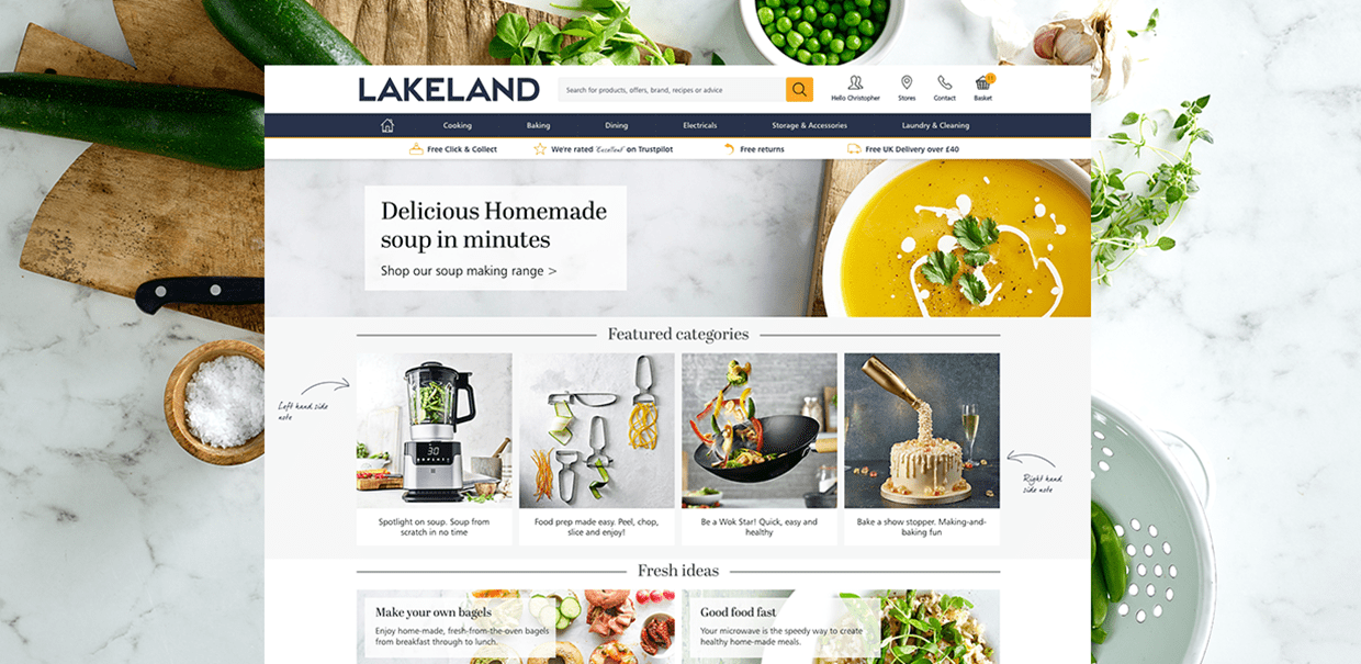
Lakeland, user experience design for eCommerce featured on Econsultancy.
We were initially appointed by Lakeland to design a more product-focused homepage, and apply this to their existing content management system. From this small initial project, our scope of work with Lakeland has grown dramatically, including designing a special microsite for their 50th anniversary and their recruitment website.
In 2015, we were proud to launch a brand new ecommerce site for Lakeland, which included an extensive user experience phase to identify exactly how to improve upon Lakeland’s existing site. Lakeland is one of the UK’s leading homeware stores, with over 50 years of experience behind them. From everyday utensils and preserving essentials, to state-of-the-art cookware, all their appliances are of the highest quality and offer great value for money.
User experience
At the start of the website design project, we carried out user testing of the existing site, with seven participants who matched Lakeland’s target demographic. They were asked to perform various tasks on the site, such as find a certain product and order using Click and Collect, with their progress and comments recorded to highlight both positives and negatives.

What we delivered
How did we do it?
Informed Decisions & Responsive, Thoughtful Interface Design
The results of this research, along with our own site audit, meant we could make recommendations founded in real-life customer feedback. These even extended beyond purely design features, but also pricing and delivery options offered by Lakeland.
We conducted extensive analysis into Lakeland’s desktop, mobile and tablet sites designs, to understand exactly how customers shop on each device. Desktop is no longer the primary device for online shopping, so it is essential for ecommerce success that the mobile site is just as slick.

How did we do it?
A Smooth User Journey & Excellent Emails
Lakeland’s previous website did not give a consistent experience on different devices – meaning customers using more than one device did not receive the same service every time. Our mobile-first approach has removed all such issues.
Lakeland have a huge range of products, and insight from user testing proved that customers often had difficulty finding what they were after. Our mega menu design not only solves this problem, but also leaves space to promote latest special offers.
Our talented design team create a number of beautiful email designs every single month for Lakeland, promoting various product ranges, as well as special offers. These also include translated versions for Lakeland’s German market.
The results?
The user experience on Lakeland’s website has never been smoother! Customers are now able to find the information they’re looking for with ease, and the beautifully designed monthly emails keep customers coming back for more.
”We had the pleasure of working with the team at Fat Media in the development of our new recruitment website. They made the whole project very easy for us and nothing was too much trouble. We were on time and on-budget but most importantly they delivered a really creative solution in keeping with our brand - we were thrilled with the results. We have a clean contemporary recruitment website which makes learning more about life at Lakeland very accessible to applicants.
Suzanne AllenPeople & Business Support Manager, Lakeland
